I created this mood board to showcase my initial ideas of my music magazine and the features that are involved in a magazine of the pop genre. I felt i knew more about this style of music and could also relate due to it also being the style of music I would normally listen to. I would then be able to create a great magazine that used my own and the public knowledge. I used artists that a known for this industry as well as the magazines and therefore my audience could relate and easily recognise the genre of the magazine. The Billboard magazine is known to the target audience that I am appealing to
when creating my own and could use this for inspiration on the features and aspects they use. I feel this would help my final product as it allows me to start thinking of the articles and features i would like inside it. It also allowed me to start thinking of the conventional features i would like to include.
This music video gives an idea of the pop genre that I have chosen to focus my magazine creation around. This is due to it being the style of music I enjoy listening to and can therefore relate more to my magazine. I feel this music could appeal to everyone however specifically teenagers of both genders. This will help me as it allows me to gather an insight into the type of music my target audience listen too.

This mind map sets out the codes and conventions of the pop genre in music magazine. I created this in order to determine which ones I would use or challenge. Firstly I will be using the register of it being colloquial and to the point. In addition to this I will continue the style of bright colours, three point lighting and a bold, eye catching font. However I will be challenging the extremely cluttered contents page as I don't feel this should be used when appealing to the target audience. I feel this helped me as it set out the generic conventions of this genre of magazine and therefore allowed me to decide which features to keep or to not use.
I carried out research on the theories created by Trevor Millum and Majorie Ferguson following facial expressions used on magazines. Using these theories I could insert those into my magazine when creating it for my main task. I feel this helped me as i gathered research on these theories in order to insert them into my final piece. The theory in which I will use in the creation of my magazine will be a chocolate box expression by Majorie Ferguson on my front cover. I think that by my model staring directly down the lens of the camera It will draw in the target audience. For the double page spread I will get my model to do a super similar expression. I feel these will make the photos seem a lot more natural to the target audience and fit in with the audience I have selected for the article I will create.

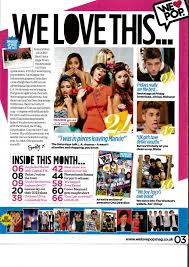
The genre of this magazine is pop: this
is obvious through the logo that has been created and the colour scheme used
but also the popular artist used as the dominant image. It is a very in your
face magazine as the colours are extremely bright which means it is
conventional and ideal for the target audience of females. The masthead of this
magazine front cover is in the shape of a speech bubble in which gives the
impression of what the target audience say about the magazine r the genre in
question. Several bright colours are used such a the pink, yellow and white.
These colours contrast well against one another and therefore are more
appealing to the audiences eye. These colours are also very female orientated
which is consistent through every edition. It also follows the conventional
feature of being very bold and in your face. The central image of this front
over is a very well known, popular artist that would also help sell the
magazine other than the features, creating brand awareness. The cover lines and
also the main cover line of this piece give and insight into the main stories
that are featured in the magazine in order for the audience to know what they
should look forward to so they buy the
edition. The slogan gives the editor a voice regarding the magazine as
this will never change throughout the editions. Situated above the masthead is
a “brand new mag” piece of text that stands out enforcing it may not be a well
established edition. The white text “gossip…fashion” shows the target audience
what is included in the magazine. This is a smaller version of the contents
page to give the target audience a sneak peak in to what to expect in the
magazine. The article of one direction
is used to attract a particular target audience. The box out is used for
exclusives that will also draw in the target audience into gossip regarding the
audience. I feel this helped as it allowed me to see exactly where features are placed in order to use the layout or not.
The presentation above highlights several ideas i had on the poses, makeup and hair of my model. I found a vary of ideas to cover all options. However when conducting this research i did narrow it down to the one on my final piece. I also decided i did not want any props used on my front cover in order to keep the focus solely on the model.


The two slide-shares above set out the colour scheme idea i had and also the look of my model in which i intend to use. The colour scheme will correspond to my primary target audience of female teenagers ages 16-19 years old. I also used fonts in which i felt related more to my magazine genre.
The names in which i came up with for my magazine are;
- Listen
- Gossip
- P
- Beats
- Notes


The magazines above inspired me as they allowed me to start thinking of basic things such as colour schemes, props, models and other generic conventions found on these pages. They also made me realise that everything has to relate back to my target audience and I should therefore have them in mind the whole time when building my ideas for the magazine I will create for my main task. I also learnt how certain features are laid out on the page such as the mast head at the top left and barcode/price in the bottom corner. These then allowed me to create my flat plans for my own magazine following their typical structure.
Making good progress here, could you make your research into facial expressions more relevant - which will you use and why?
ReplyDelete